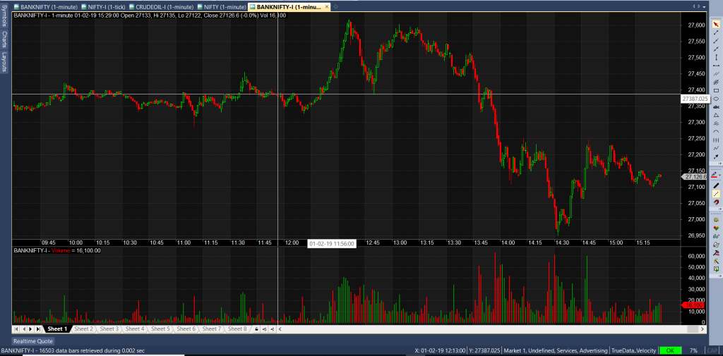
(Stock charts: Based on the number of ticks/candles)
When you look at your stock charts for making trade decisions, do you wish to see beautiful-looking charts with more candles & ticks? Or do you wish that your charts are accurate?
Both, you would say - More Candles = Accurate Stock Charts!
Yes, they can be good-looking, provided there are a lot of ticks/trades and that the (stocks/symbols) in question is not ill-liquid.
It is not possible for your ill-liquid stock charts to be filled up and look as beautiful as the liquid ones.
Because the stock/symbol just does not have enough quotes/trades to fill the charts up, in your selected time frame.
But that does not make your charts inaccurate at all!
Understand, that not all stocks are traded all the time.
Even some highly liquid stocks could sometimes have no trades for over a minute or even more.
However, it is natural for some novice & sometimes even experienced traders to consider more ticks in a chart as more accurate.
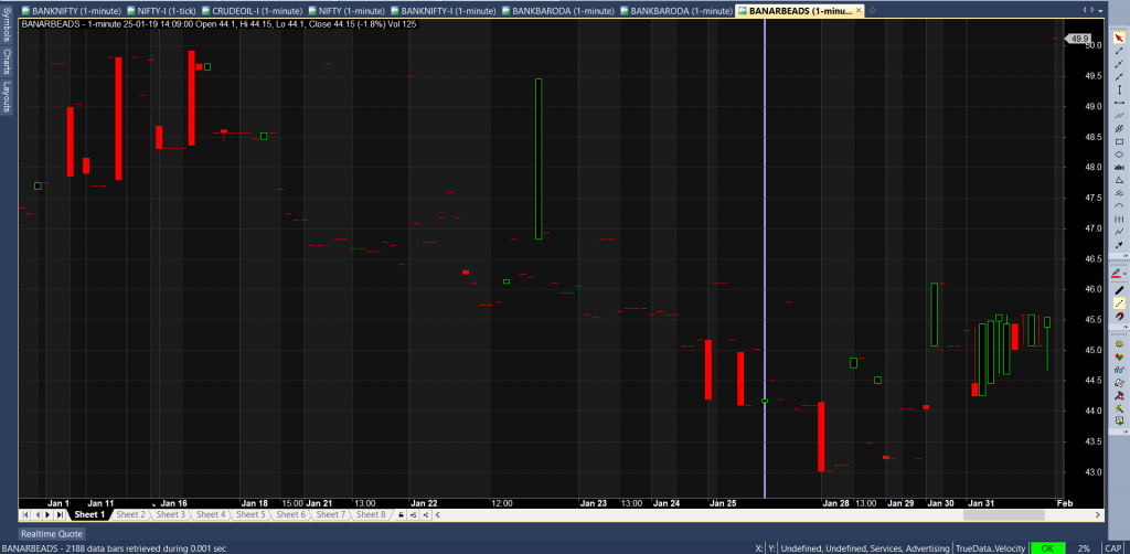
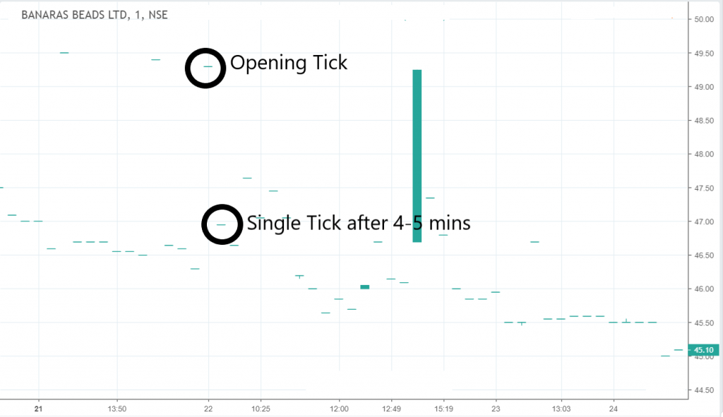
This phenomenon is seen in both liquid and ill-liquid stocks but for ease of understanding, I am going to use here an ill-liquid stock chart of a company called BANARAS BEADS LTD (NSE Symbol: BANARBEADS)
There seem to be more ticks & thus candles in "Pic 3 - Data vendor A" than in "Pic - 4 - Data vendor B."
As there are more ticks, the chart of Data Vendor A must be better & accurate. Right?
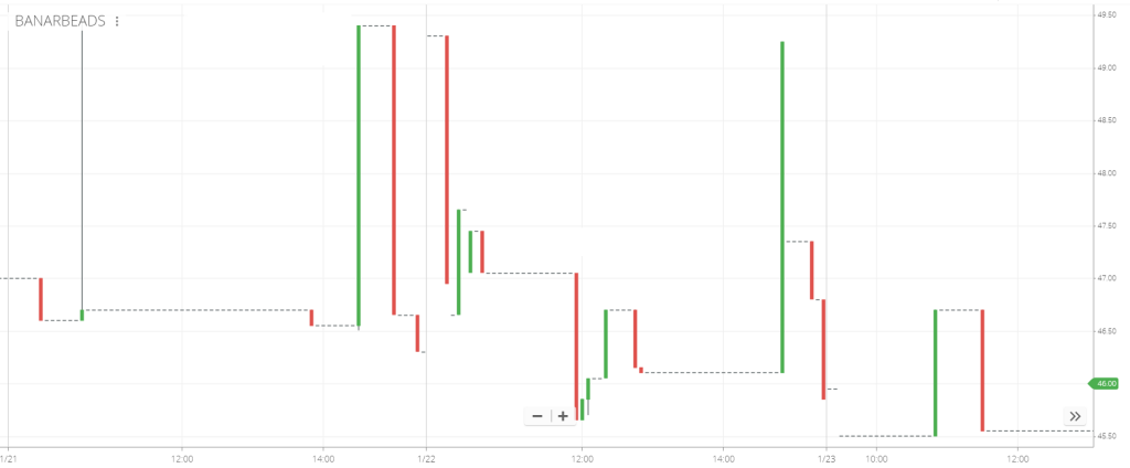
Wrong! Let me tell you, not a single quote has been missed here in "Pic. 4 - Data Vendor B."
Since you can see the gaps and incomplete candles in 'Pic - 4 - Data Vendor B' as compared to 'Pic 3 - Data Vendor A'.
No, he missed no ticks. It is amazing and surprising to see the difference and you would be astonished to know the reason.
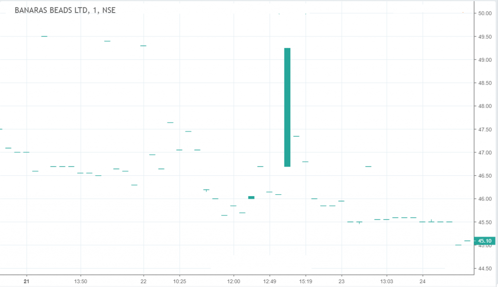
It should be just a dot or a single line in a bar chart because the Open, High, Low, and Close are all the same for the 1-minute candle. Obviously! Right?
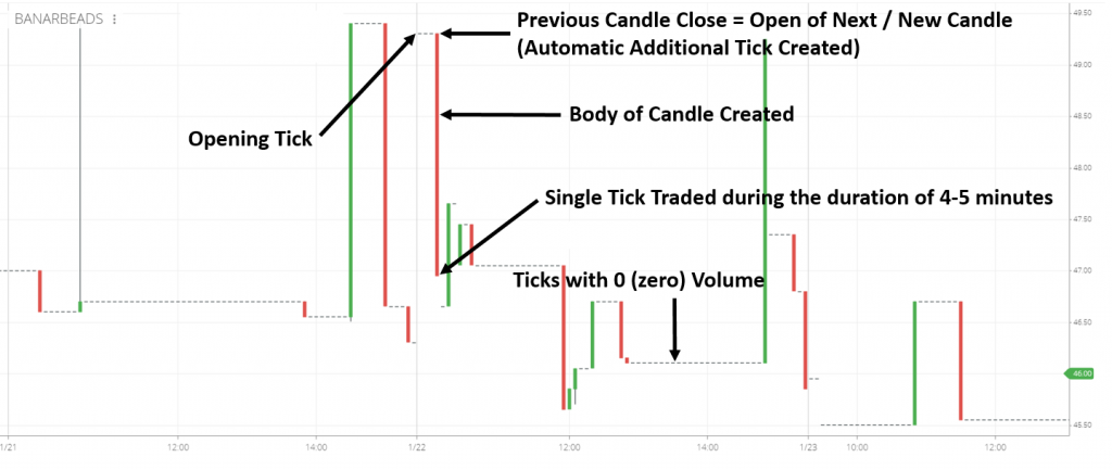
We found that the data plugins or the inherent feed itself of some of the data vendors/brokers like 'Pic 3 - Data vendor A'. Results in the "automatic insertion of additional ticks" at certain points on the chart.
Most of the time, the data vendor does not even know, though sometimes, they do it knowingly.
If you look carefully at the charts, you will find that the vendor is depicting the following. (You can view this in live markets also) :-
>> The close of the previous 1 min. candle becomes the open of the current/next 1 min. candle when a new tick lands up.
>> So in this case, the opening of the new candle = the close of the previous 1 min. candle (new tick generated automatically) and the close of the current candle = the single tick that came in.
>> This creates a wrong and unnecessary additional tick, which also results in the creation of a candle with a body, which should normally be absent.
>> This actually means, that the stock traded at least twice during that 1 min. candle, whereas it had traded only once.
>> This is also possible with more than 1 tick, in case the opening tick does not come exactly at the opening time of the candle.
>> As can be seen from the charts, some vendors also create Zero volume ticks/candles, for every passing minute, even when there is no trade/tick.
Hence, the charts look more filled up and beautiful, tempting even the best of experts to rely on these filled-up charts more than the accurate ones!
This wrong and misleading depiction of your stock charts creates wrong results or outputs when you run scans or overlay indicators on these stock charts.
Since extra ticks have been added, even though there was no such trade - your indicators could never be correct.
Although your charts had more ticks & look beautiful.
Track the charts of an ill-liquid stock/symbol (which trades once in 1 min. or greater than 1 min.).
And see, what your vendor does when a single tick comes in.
>> Issue 1 - Does he pull in the "Open" from the "Close" of the previous candle? If yes, then you have your answer.
>> Issue 2 - You also need to check for the other case, where your vendor gives zero volume ticks.
Vendors could have one of the above errors or even both of the above.
For the data to be depicted correctly in 1 min. candle format, the "Open" of your candle must not be formed as the "Close" of your previous candle, when there is only one or very few quotes per minute.
The first tick landing up in any 1-minute duration should be the 'Open.'
And, if there is no other tick for that minute, it should also be the 'High', 'Low', and 'Close'.
Many people think that beautiful-looking stock charts with more ticks and more candles like that of "vendor/broker A" are better than that of "vendor/broker B."
Whereas, "vendor/broker A" actually created false ticks to make the stock charts look filled up and beautiful.
I have seen people wondering in disbelief when they see this phenomenon in the stock charts of their beloved broker/vendor.
My attempt here is to, enlighten everyone to make sure that their scans and studies are created from accurate stock charts and not just beautiful stock charts with inserted ticks.
I also hope that vendors/brokers who read this post will learn from this post and correct their charts.
So that, they stop misleading their customers and the general public at large with their beautiful stock charts and instead stick to the accuracy as desired.
Please leave your thoughts or share screenshots of such instances of beautiful & filled charts that you find for the benefit of other readers/traders.
Kapil Marwaha is the Founder & Managing Director of TrueData Financial Information Pvt. Ltd..
His aim - "To make TrueData the Best Trading Decision Support company in the country." TrueData's flagship product Velocity 2.0 has already become immensely popular and is used by a large audience through out the country.
hello. could u suggest me the best chart for stocks
Hi,
Hello sir! Please let us know how we can assist you.
Do you know, only about 3 of India’s population is actively invested in st...
Introduction Real Time Data from NSE, BSE & MCX is distributed to various d...
NSE Stock Prices in Excel in Real Time - Microsoft Excel is a super software cap...